DesignWrld.
I helped design a friendlier space for designers to share work, get feedback, and learn together. Built under the Paul G. Allen School of Computer Science, our project won Best Design against 20 teams.
Project Brief
Designers grow through feedback, mentorship, and repetition. We explored why existing platforms often feel too formal for early work and why that creates friction for asking for help. We designed DesignWrld to lower the social pressure and make learning feel ongoing instead of transactional.
Context
- Academic team project under the Paul G. Allen School of Computer Science
- Focus on designers building case studies for their portfolios
- Mid fidelity prototype in Figma
What I contributed
As the product designer, I owned the visual and interaction design, translating research insights into mid-fidelity flows that reduce intimidation, improve discoverability, and make feedback easy to start.

Problem
Platforms like LinkedIn, Cofolio, Behance, and Dribbble make sharing feel polished and professional, which is great for showcasing finished work. But for learning, many designers hesitate to post early drafts or ask questions because outreach feels awkward and high effort.
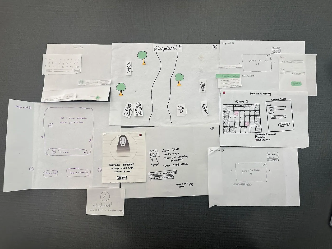
Design Research
Initial sketch outlining the case study screen and key actions like messaging and booking a meeting.
Design Principles
We used a small set of principles to make tradeoffs and keep the product focused on behavior change, not novelty.
Principles we designed for
- Reduce social pressure: make it feel normal to share unfinished work
- Make discovery effortless: help users find work by tools and interests
- Guide feedback: prompts that make responses specific and useful
- Keep it friendly: tone and visuals that invite participation
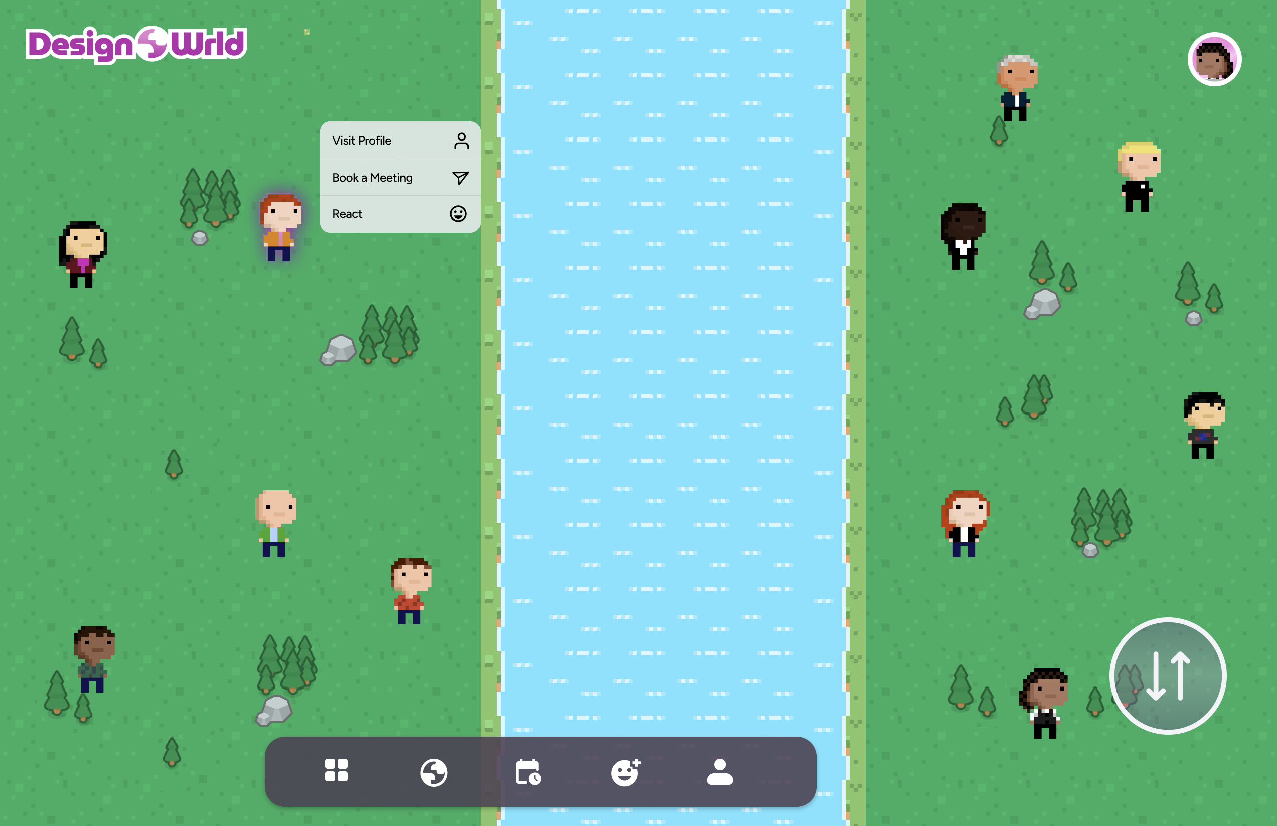
Why a world concept
A virtual world framing helps the experience feel more like exploring than evaluating. That shift matters because intimidation was a primary barrier. We used the environment as a metaphor for browsing, meeting, and learning without forcing formal networking behaviors.


The Solution
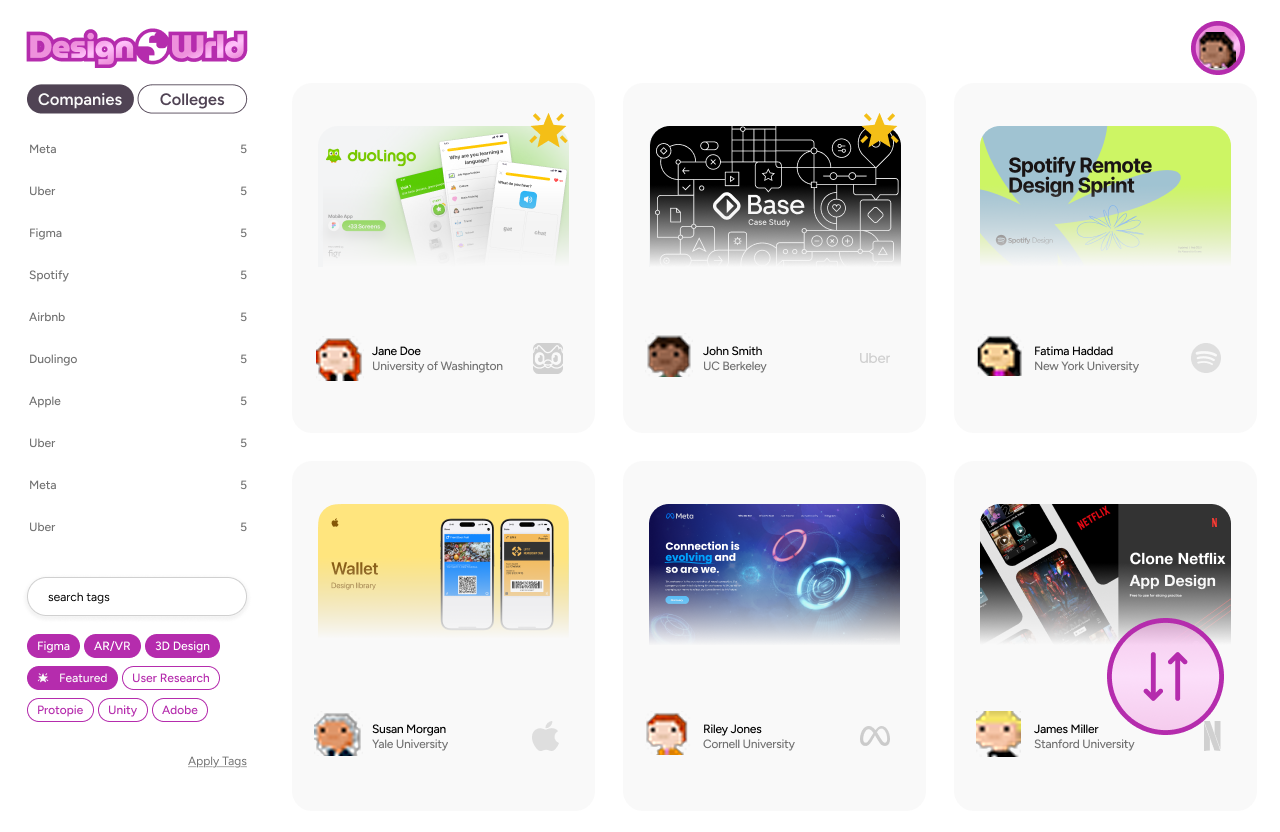
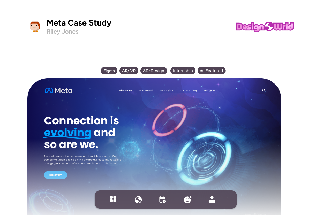
DesignWrld is a 3D inspired portfolio world where designers can explore projects like exhibits, leave structured feedback, and start conversations with less friction. We focused on flows that move users from browsing to contributing quickly.
Core flows in the mid fidelity prototype
- Explore a world map to discover projects by interest and tool
- Open a project room to view context, process, and outcomes
- Leave feedback using prompts to reduce blank page anxiety
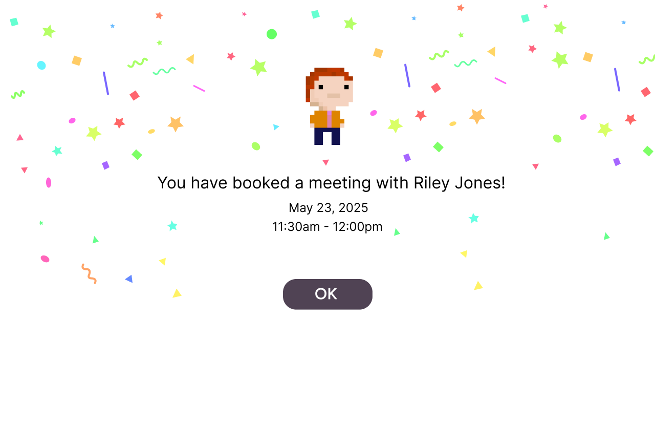
- Start a casual conversation from the project itself
What I would show in a review
- World discovery entry point and navigation
- Project room layout and information hierarchy
- Conversation entry points that avoid formal outreach
Why It Works
Our design choices were aimed at one outcome: make feedback feel easier to start than to avoid. The world concept supports that by changing the tone from formal networking to shared exploration.
Reduced activation energy
Structured prompts help users give useful feedback without overthinking. Clear entry points and lightweight interactions reduce the feeling that every message needs to be perfect.
Better discovery and relevance
Designers often seek inspiration based on tools and interests. Organizing discovery around those mental models makes it easier to find the right work and reduces time spent searching across multiple platforms.
What I Learned
This project reinforced that community products live or die by social friction. The hardest part was not designing screens, it was designing comfort. I learned to translate emotional research insights into concrete interaction patterns that reduce anxiety and help users participate.
What I would do next
- Usability test discovery and feedback prompts with first time users
- Validate whether the world metaphor improves confidence or adds complexity
- Refine moderation and safety patterns for constructive critique
Future product opportunities
- Feedback templates tailored by discipline like product design or visual design
- Personalized spaces that highlight progress and encourage return visits
- Mentorship moments that feel opt in and low pressure