Case Brief
A student-first festival ecosystem
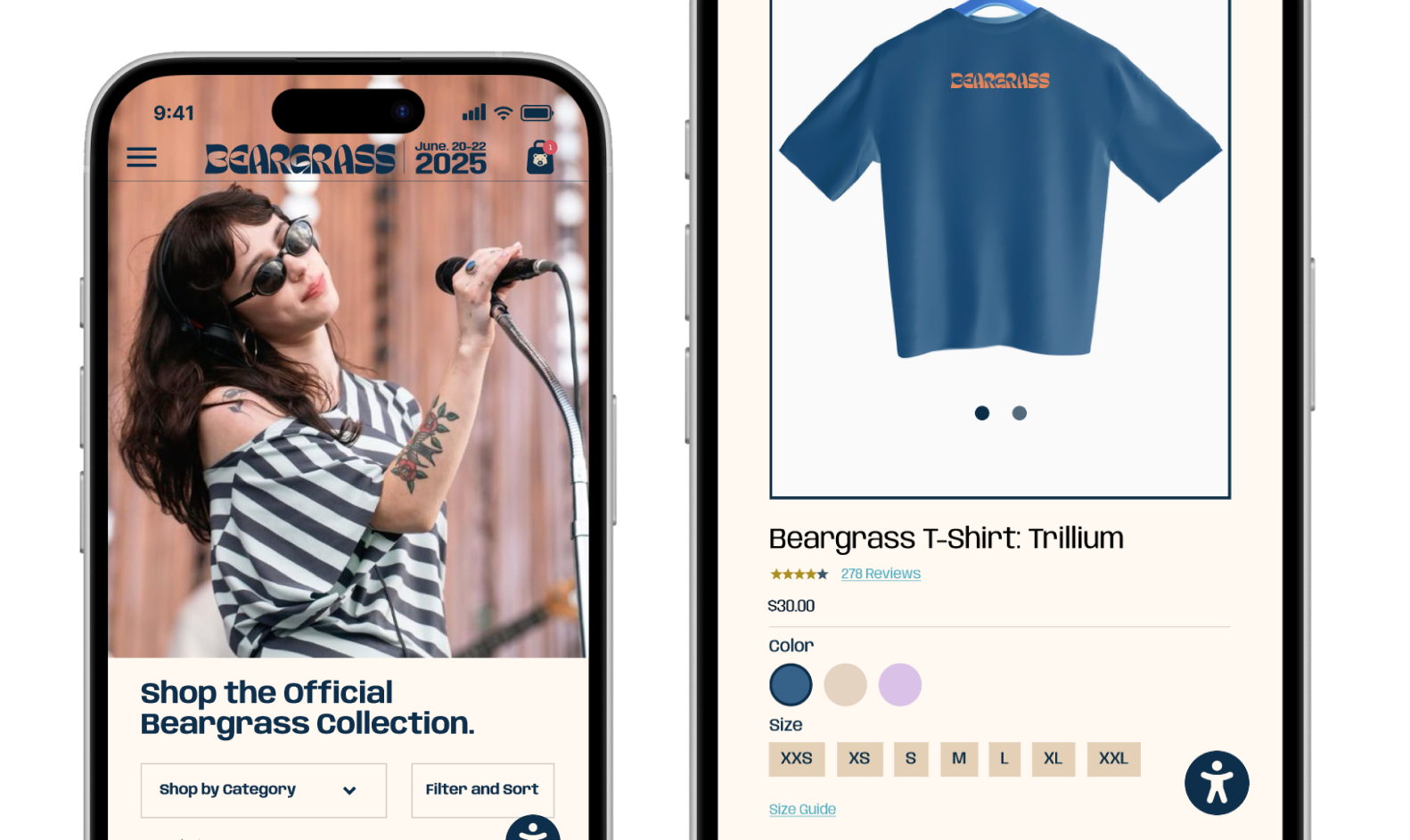
In Visual Communication in Human Centered Design and Engineering, I created a festival experience centered on how students actually move, decide, and connect during live events. We had the freedom to choose any type of festival and define its identity from scratch, so I designed an indie music festival for college students that felt welcoming, playful, and easy to navigate. I approached it as a full ecosystem rather than just an app, shaping the brand, digital flows, merchandise, and physical touchpoints like posters and signage to work together. The goal was to make every interaction feel clear, cohesive, and grounded in the real needs of attendees.
The Problem
A festival is only as strong as the story it tells
The Opportunity
Designing a brand built to travel beyond the stage
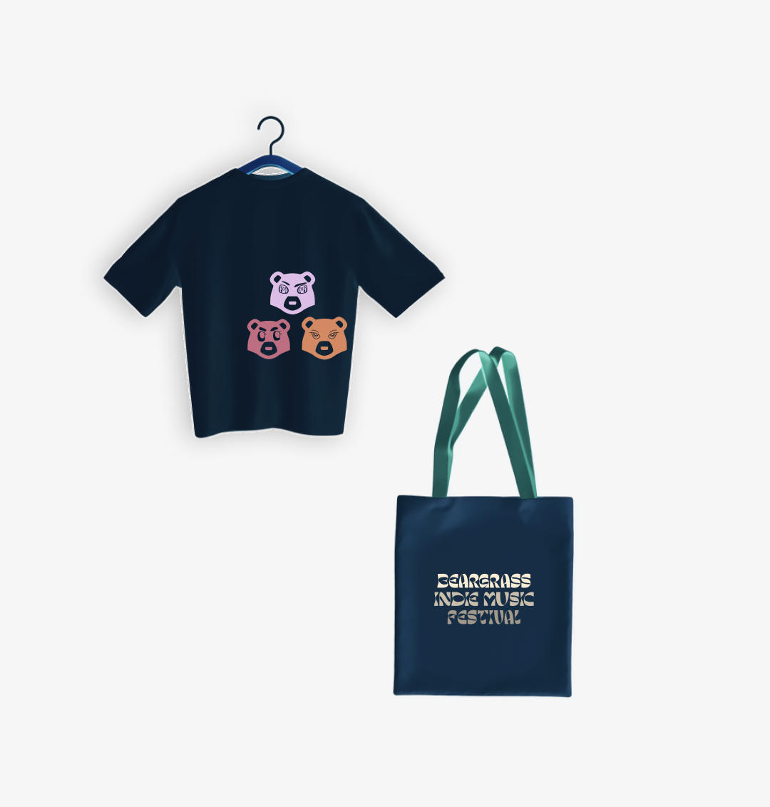
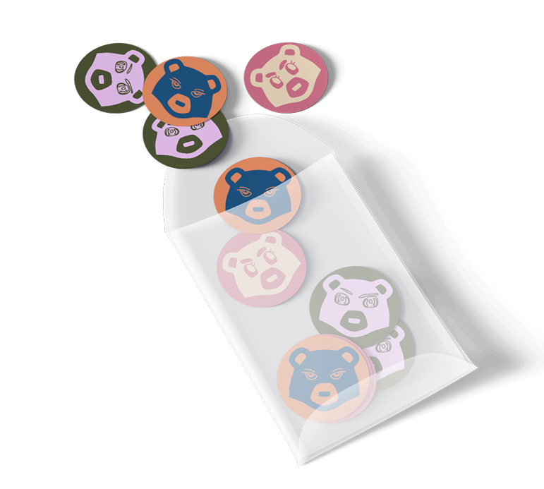
This opened the door to design a festival identity that felt distinct, recognizable, and built to travel across touchpoints. I prioritized creating a strong and flexible visual system, ensuring the logo, typography, color palette, and graphic language could scale seamlessly from digital interfaces to posters, signage, and merchandise. With that foundation in place, I layered in expressive details to make the brand feel playful and culturally relevant. The goal was to create an identity that attendees could easily navigate and genuinely connect with, one they would want to represent long after the event ended.
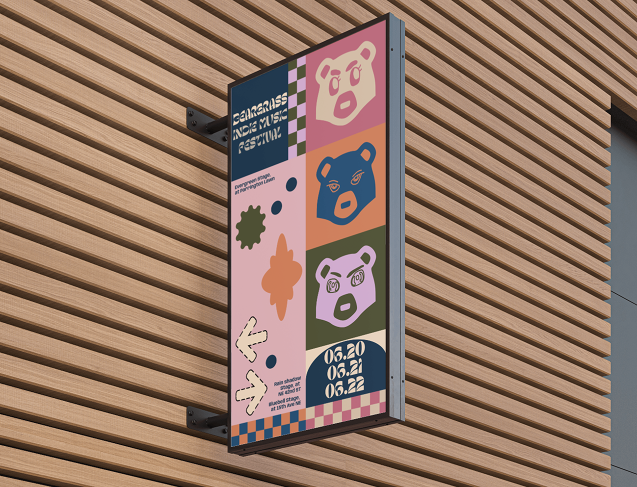
Where the identity came to life
Signage focused on translating the visual system into clear, scalable wayfinding that guided attendees while reinforcing the festival brand throughout the space.
Competitive Insights
What strong festivals get right about brand and clarity
I studied successful music festivals to understand how branding and wayfinding work together in fast paced environments. The strongest examples balanced bold visual identity with clear hierarchy, using limited color systems, repeatable icons, and consistent environmental cues to help attendees scan quickly and make confident decisions. Festival goers rarely stop to read detailed information. They move, glance, and decide. This research reinforced the importance of designing for clarity at every touchpoint, ensuring the brand could stand out while still guiding people seamlessly across screens, signage, and physical spaces.
Journey + Principles
Mapping what students need at each stage
Visual System
A brand system designed to scale across screens and space
I designed a lightweight visual system that works across both mobile screens and large festival signage. The goal was to keep the experience friendly, expressive, and easy to scan in busy environments. I paired Margeo, a playful rounded typeface, with Anybody, a bold and highly legible font, to balance personality with clarity. I also created a set of bear icons that reflect the welcoming spirit of the festival while doubling as wayfinding cues, helping attendees quickly match what they see on their phones with signs around the venue. Combined with a color palette built for quick scanning, the system keeps the brand consistent and easy to navigate across every touchpoint.
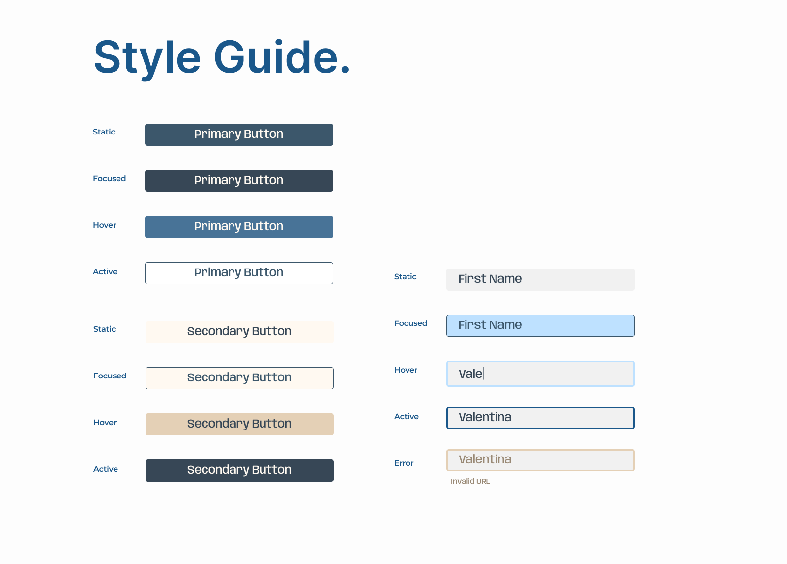
Designing for clarity
The style guide defines the typography and button styles, ensuring text stays readable and actions remain clear across the festival’s digital experience.
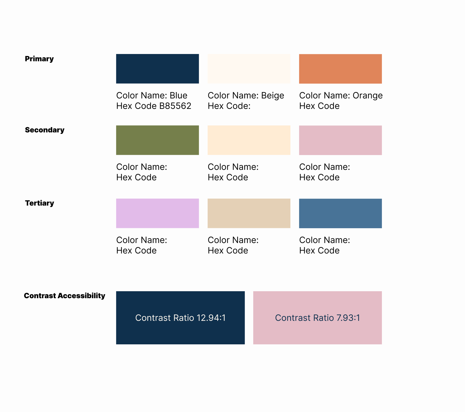
Color that guides the experience
The color palette was designed to help attendees quickly scan information and recognize key areas throughout the festival.
The Solution
A cohesive festival ecosystem
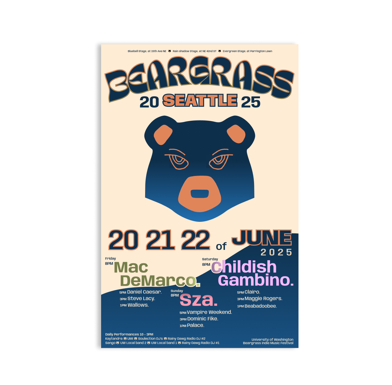
I designed the festival as a connected experience across mobile and physical spaces. The same icons, color cues, and typography appear in the mobile prototype, posters, and signage so students can quickly scan information and navigate the festival with confidence.
Learnings
Consistency is usability when people are moving fast
This project reinforced for me that strong product design is rarely about a single screen or feature. It is about building systems that help people understand and navigate complex environments. Rather than focusing only on individual interface moments, I had to think about how a visual language could scale across contexts and still feel clear and consistent. That meant designing patterns that could work on a mobile schedule view, on a large poster across a crowded lawn, or on signage guiding people between stages. The goal was to create a shared mental model so attendees could quickly recognize cues and move through the festival without having to relearn how things worked at each touchpoint.
It also pushed me to think in terms of repeatable rules rather than one off solutions. Typography, icons, and color cues needed to behave predictably so people could scan information quickly and make decisions while on the move. By treating the festival as a system instead of a collection of artifacts, I focused on clarity, consistency, and recognizable patterns that scale. This way of thinking mirrors the challenges product teams face when designing for large platforms where people interact with products across many surfaces. Designing systems that stay intuitive as they grow is essential, and this project helped me practice creating structures that make complex experiences feel simple for the people using them.
Next
What I’d improve with more time
If I continued this project, I would run usability testing earlier with low fidelity flows to validate the information hierarchy and naming before refining the visuals. Testing earlier would help surface navigation issues sooner, reduce rework, and strengthen the overall cohesion of the system. Looking ahead, there is also an opportunity to expand the experience with features like an on site assist mode that offers quick directions, reminders for upcoming sets, and accessible route options. In the long term, an augmented reality layer could help attendees orient themselves in crowded environments, but only after confirming that the core wayfinding experience works clearly and reliably.
