Eat Together.
A redesign focused on turning everyday meals into clearer, more human connection.
Brief Overview
Turning shared meals into something more
In early conversations, the founders emphasized that the product should never feel transactional or superficial. It should help students understand the person across from them, spark genuine dialogue, and create an environment where individuals are respected as whole human beings rather than reduced to labels or cliques.
As the platform expanded to over 600 University of Washington students, that vision extended into features like a restaurant picker, dining dollar exchange, friend recommendation algorithm, and a gallery for capturing past gatherings. Each feature was designed to support connection before, during, and after the meal.
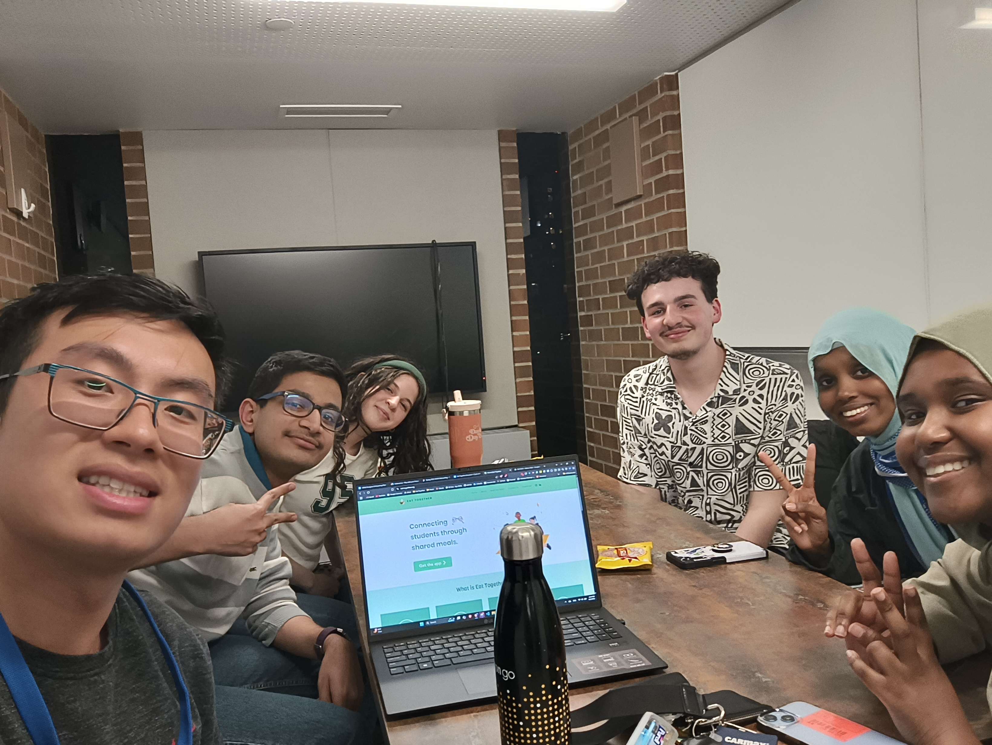
Where the vision took shape
Core Team meeting with Eat Together’s founder, director, and design team: Eric Xiao, Navneeth Dhamotharan, Ruweyda Abdi, Mumtaz Sheikhaden, and Sebastian Hriscu, where we aligned on vision, goals, and the direction for the upcoming redesign.
The Problem
When profiles fail, connection never begins
The Solution
Turning confusion into clarity across the product
As these improvements exposed deeper system inconsistencies, I continued tackling the problem on the core team. I refined interaction feedback, improved accessibility standards, and aligned components within a more cohesive design system. What began as a profile redesign evolved into a broader effort to ensure the product consistently supports genuine connection through clarity, usability, and thoughtful detail.
User Research
Understanding where connection breaks down
Value Proposition
Designing for genuine connection, not just coordination
Help students build real connections through meals by making it easy to express preferences and discover compatible people.
Branding
Using visual identity to reinforce human connection
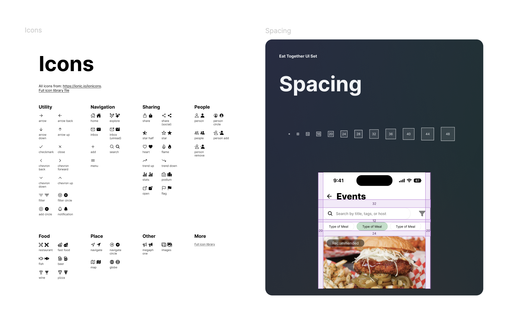
Creating clarity through structure.
Standardized spacing and iconography to strengthen hierarchy and ensure every screen feels consistent, intentional, and easy to navigate.
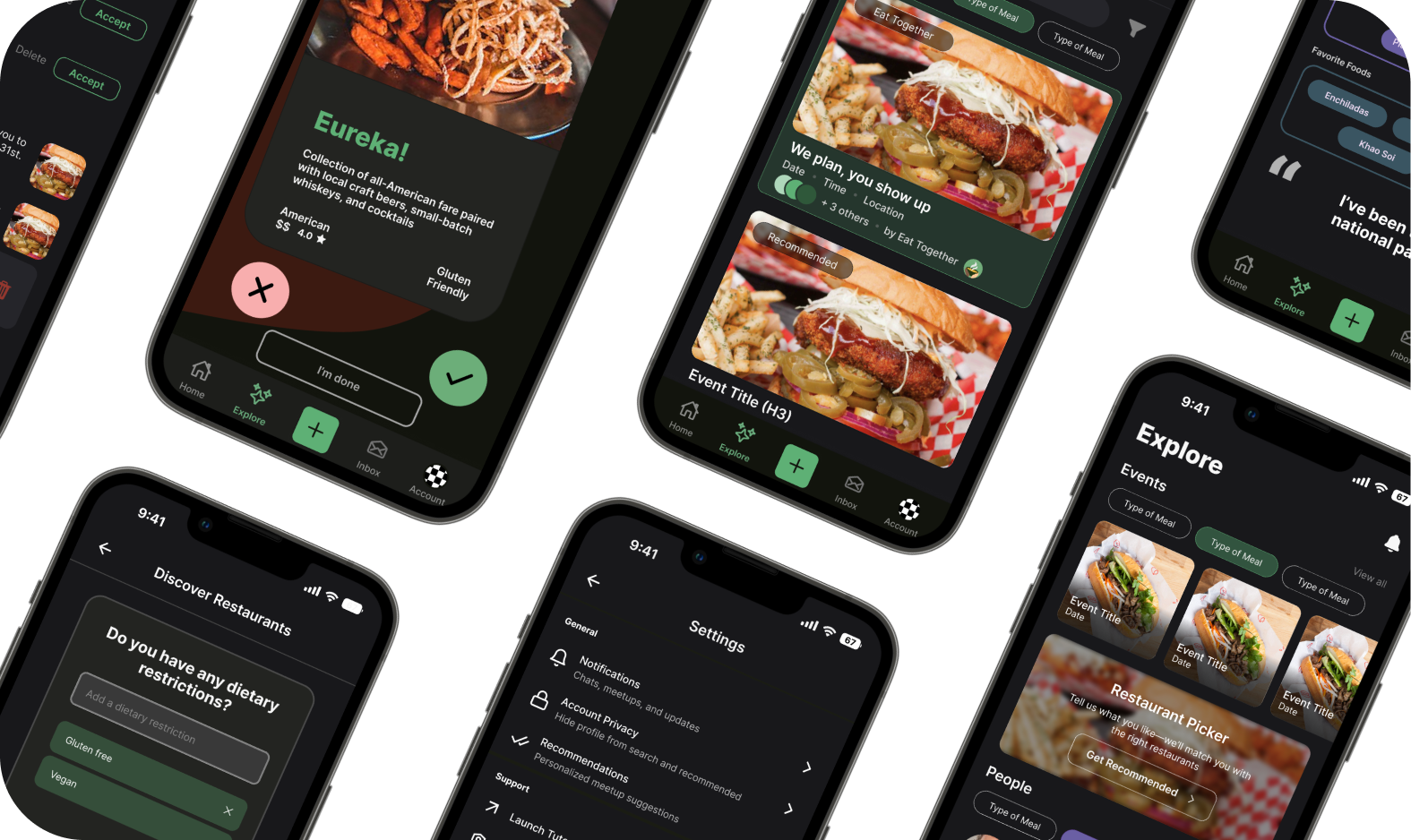
Final Cohort Designs
Our Team's Solution
Clear hierarchy for faster scanning.
Users consistently looked at tags first to decide who they would want to meet, so I made tags easier to scan and faster to update.
I surfaced high-signal details like school and food preferences earlier while reducing emphasis on lower-signal content.
The result is a profile that reflects what users care about and makes personalization feel intentional instead of overwhelming.
Beyond the Cohort
Growing into Design Leadership
As I grew in the role, I stepped into a Lead Product Designer position on the core team. My focus expanded from shipping individual features to shaping a more cohesive product experience. I led efforts around accessibility standards, refined microinteractions, and introduced dark mode to ensure the app feels intentional and consistent across contexts.
Core Team
Dark Mode
Through color audits, I identified multiple contrast failures and inconsistencies within our token structure that required correction before scaling. I conducted competitive reviews and facilitated usability sessions to evaluate legibility, perceived depth, and comfort during extended use. Within a 10 week timeline, I reworked affected components, standardized contrast ratios, aligned tokens with accessibility guidelines, and delivered updated flows to engineering. The outcome was a cohesive dark mode experience supported by a more accurate and resilient design system.
Bringing consistency and accessibility to dark mode.
I led usability testing and a competitive review to shape a dark mode that keeps hierarchy intact, feels clean and cohesive, and stays consistent across the app.
Navigation System Enhancement
Making the Navigation Feel Alive
I studied interaction patterns from products with similar young, mobile first audiences and focused on principles of clarity, responsiveness, and delight without distraction. The motion is quick, consistent, and purposeful, aligning with Eat Together’s energetic tone while maintaining usability and accessibility standards.
Subtle motion that reinforces action.
The interaction provides clear feedback on selection, improves perceived responsiveness, and makes navigation feel intentional and alive without overwhelming the interface.
Design System & Team Operations
Designing the System Behind the Screens
Strengthening the foundation.
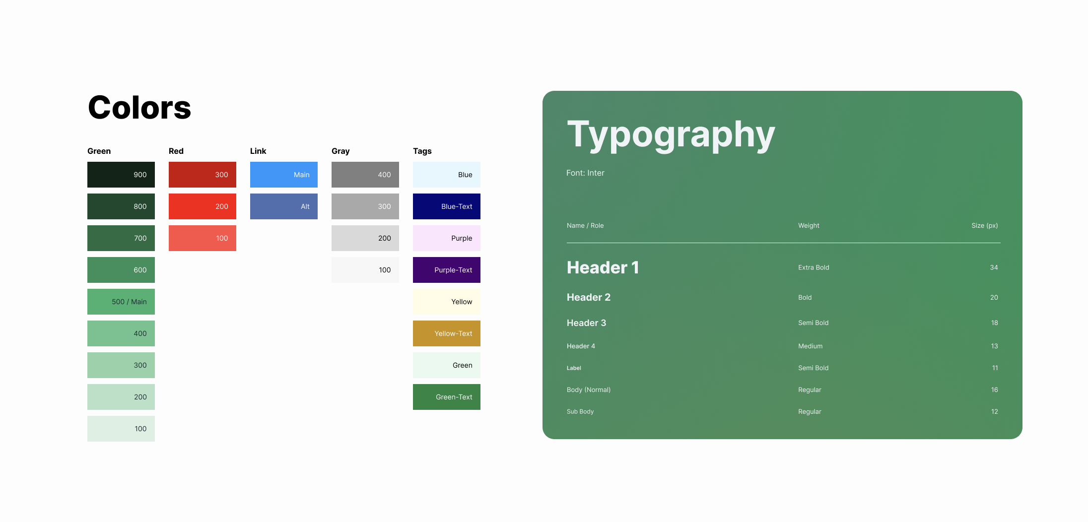
Refined color accessibility and typography standards within the design guide, improving contrast, hierarchy, and consistency across the product.
Reflection
From shipping features to shaping the product
As I transitioned onto the core team, my scope expanded beyond individual screens. Leading dark mode pushed me to think at the systems level, from contrast and accessibility to token accuracy and visual cohesion. I introduced thoughtful microinteractions to make navigation feel responsive and alive, and helped formalize a more consistent design system so decisions scaled across the app.
Across both phases, my role shifted from executing improvements to defining standards. The through line was the same: reduce friction, increase clarity, and create a product experience that feels intentional at every touchpoint.
Key Learnings
Design leadership is about clarity, not control
I also learned the importance of building systems early. Whether refining profile hierarchy, introducing dark mode, or prototyping microinteractions, consistency reduced friction for both users and teammates.
Most importantly, I learned that leadership in design means raising the quality bar while empowering others to contribute to it. Clear standards, shared critiques, and thoughtful documentation created momentum that extended beyond any single feature.
Next Steps
Scaling the system with intention
From a systems perspective, continuing to refine accessibility standards, documenting dark mode components more deeply, and expanding tag flexibility with stronger backend support would further mature the product. The goal is to evolve the experience without sacrificing clarity, safety, or cohesion as the app grows.